 Github Stars:
 Last Commit:
  Created:
Overview
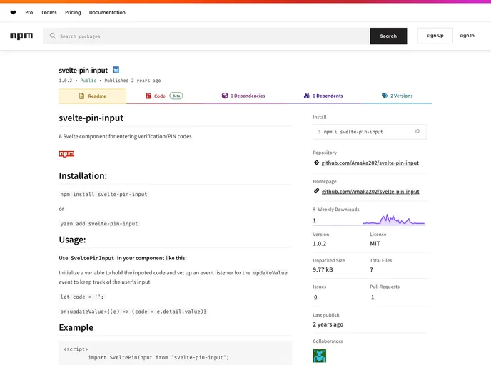
The Svelte Pin Input is a sleek and flexible component designed specifically for entering verification or PIN codes within applications. With a user-friendly interface, it seamlessly integrates into Svelte projects, making it easier for developers to implement secure input fields. This component not only enhances user experience but also provides various customization options that cater to different design preferences and project requirements.
Whether you’re building a login system, payment verification, or any feature that requires secure pin entry, Svelte Pin Input has you covered. Its intuitive setup and features like adjustable input types and styling make it a perfect choice for developers looking to enhance their application’s functionality and usability.
Features
- Customizable Size: Easily adjust the size of the input fields with the
sizeprop, allowing for a layout that fits your application’s design. - Flexible Input Types: Choose from
text,number, ormixedinput types to suit the needs of your verification process. - Styling Options: Apply optional CSS styles to both the container and input elements, letting you maintain a consistent design throughout your application.
- Input Validation: Utilize the
patternprop for regex input validation, ensuring that the input complies with specific criteria. - Hide/Show Input: Control the visibility of the input fields with
isInputHidden, enhancing security by hiding the PIN during entry. - Disabled State: Toggle the
disabledstate of the input fields, preventing user interaction when necessary. - Validation Feedback: Use the
isValidprop to indicate whether the input is valid, helping users understand input errors promptly. - Event Tracking: Capture user input through the
updateValueevent, making it easy to track changes in real time.


