 Github Stars:
 Last Commit:
  Created:
Overview
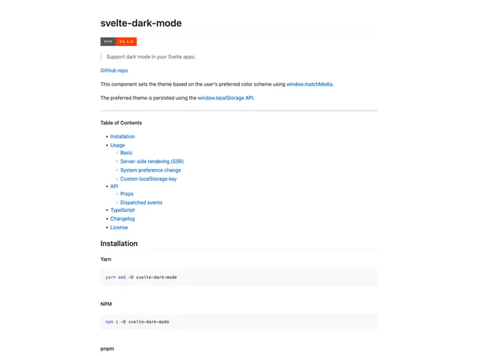
The Svelte Dark Mode component allows developers to support dark mode in their Svelte apps. It sets the theme of the app based on the user’s preferred color scheme using the window.matchMedia function. The preferred theme is persisted using the window.localStorage API.
Features
- Supports Dark Mode: Sets the theme based on the user’s preferred color scheme.
- Persistence: The preferred theme is persisted using the
window.localStorageAPI. - Server-side Rendering (SSR) Support: Provides guidance on accessing
document.bodyordocument.documentElementin SSR scenarios. - System Preference Change: Automatically updates the theme if the user changes their color scheme preference at the system level.
- Custom LocalStorage Key: Allows customization of the local storage key used to track the persisted theme.
- Dispatched Events: Dispatches an event when the theme is updated.
Installation
To install the Svelte Dark Mode component, use the following steps:
- Install the component via NPM:
npm install svelte-dark-mode
- Import the component into your Svelte app:
import { DarkMode } from "svelte-dark-mode";
- Use the
DarkModecomponent in your Svelte app:
<DarkMode />
Summary
The Svelte Dark Mode component is a useful tool for Svelte developers looking to support dark mode in their applications. It offers several key features, such as support for system preference changes, customizability, and persistence of the preferred theme. By following the installation steps, developers can easily integrate the component into their Svelte apps and provide a seamless dark mode experience for their users.


